Scoring Tool: Measuring Design System Adoption Across Products
Company: Philips

Project Summary
Led a qualitative research study and designed a scoring prototype to help Philips measure how consistently products align with its design language system. The tool enabled teams to surface gaps, track adoption, and plan roadmap improvements more strategically.
Timeline & Team
4 months start to finish with 3 person team spread across 2 office locations. I was the user researcher, experience designer and project manager. I worked with a developer and a product owner.
Technical Contribution
Built the tool using React and JavaScript, translating scoring logic into a structured, production-ready interface
Designed the component structure and data flow to support scoring across multiple products and locations
Worked with backend teams to align data models and API integration for tracking adoption metrics
Structured the UI to handle real-time updates and large datasets, ensuring performance and clarity
Bridged UX and engineering by ensuring the solution was both usable and technically scalable
Responsibilities
User research
Experience design
Prototyping
Usability testing, working closely with a developer and product owner across two locations.
Outcome
Reduced scoring turnaround from 2 days to 48 minutes within the first month of launch, improving visibility into design debt and enabling faster roadmap planning.
OVERVIEW
Fragmented & Manual Tracking of Design System Adoption
To justify investment in product development, Philips products must adhere to the company’s latest design language system. However, the existing process for measuring adherence was manual, subjective, and inconsistent across the portfolio.
Key challenges include:
Time-consuming process: Audits were conducted in spreadsheets with no automation, taking up to a week per product
No single source of truth: Files were stored on shared drives, making access and version control difficult
Limited scalability: Only one person could perform an audit at a time, slowing down the review cycle
Lack of standardisation: Scoring varied from team to team, with no consistent criteria or accountability
Complex onboarding: New users struggled to learn the system due to poor documentation and unclear workflows
These issues created friction for both product teams and design stakeholders, ultimately hindering the company’s ability to measure adoption and plan improvements confidently.
SUMMARY
Streamlining Design System Scoring Across the Portfolio
Philips identified a clear opportunity to streamline how product teams measure adoption of the design language system, reducing friction, improving consistency, and enabling faster, more reliable decision-making.
48 minutes vs. 2 days
scoring time reduced dramatically through automation and simplified workflows
1 unified scale
a standardised, easy-to-use scoring system replaced subjective and inconsistent methods
+64% user satisfaction
users reported a significantly better experience thanks to clearer guidance and faster results
By transforming the scoring process into a structured, digital experience, Philips made it easier for teams to identify gaps and track progress, all while reducing operational overhead.
RESEARCH
Understanding Pain Points Across Roles
To uncover the purpose, challenges, and improvement areas in the existing scoring system, I conducted 10 user interviews with product owners, product designers, and business partners. The goal was to map out real-world workflows and identify where the spreadsheet-based process was breaking down.
4 Product owners

SAMPLE QUESTIONS
How did you learn about the score when looking at the spreadsheet?
Why do you think designers struggle filling in the spreadsheet?
What part of the system would you like to see an improvement on?
4 Product Designers

SAMPLE QUESTIONS
How long does the process take?
Talk me through your process.
What the challenges you face when filling in your spreadsheet?
2 Business Partners

SAMPLE QUESTIONS
Why do you use there spreadsheets?
What problems do you encounter with the adoption score?
What could be done better?
This research helped reveal common frustrations, inconsistent interpretations, and a general lack of clarity, all of which informed the experience design and scoring logic for the new tool.
Key Pain Points in the Existing Scoring Process
Analysis of the user interviews revealed systemic issues that impacted efficiency, usability, and trust in the adoption scoring process. These insights directly shaped the design of the new tool.
-
Users found it hard to identify which scores had been updated and when, due to the lack of history tracking in the spreadsheets.
-
It was unclear who entered specific data and when, making it difficult to audit, verify, or collaborate effectively.
-
Filling in the spreadsheets was time-consuming, as users had to constantly switch between the scoring sheet and the design language documentation.
-
Without visual cues or summaries, users struggled to interpret the scores at a glance — especially across large product portfolios.
“It would be great if we could have a dashboard of sorts that gave a summary of everything”
Focusing the Experience Around Two Key Users
Based on the research, I defined two primary user types to guide the design decisions: a product owner responsible for oversight and reporting, and a designer responsible for completing the score.

Mike: The Product Group Owner
Overseas the products for Image Guided Therapy. Evaluates and reports the scores to the leadership
WANTS TO:
To find the scores quickly for reporting
Know which parts of the product need improving at a glance
KEY INSIGHTS:
Has to check to see if 8 product spreadsheets have been filled in before he can get a group score
Mike maintains his own master spreadsheet so he can protect his work from any errors that may come through

Sharon: The Designer
Deliver designs for an ER product.
Uses components from the design system to implement into their design
WANTS TO:
Not have to think too much about scoring
Have all the information (design language) in one window
KEY INSIGHTS:
The spreadsheets gives insights on the areas that need updating
Sharon dreads having to fill in the spreadsheet and finds she’s scrambling to get it done
EXPERIENCE DESIGN
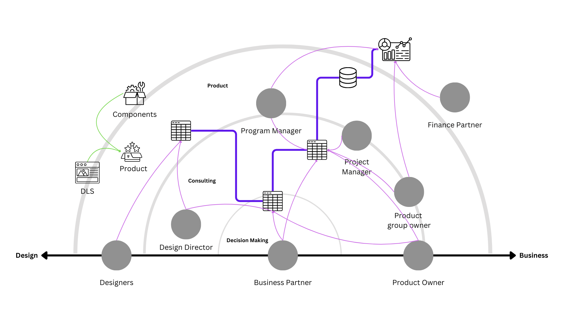
Mapping the Scoring Experience as a Service
Before jumping into screens, I took a step back to understand the scoring process as a service ecosystem. This helped identify not just usability issues, but also breakdowns in communication, accountability, and tooling across the scoring workflow.
Ecosystem mapping:
I visualised how scoring fit into the broader product lifecycle — including the roles involved, systems touched, and handoffs required across functions.
Experience Sketching:
Next, I mapped the current-state experience of scoring a product, identifying key friction points and emotional highs/lows across the process.
Userflow Design:
Using these insights, I created a user flow for the redesigned tool — focused on streamlining tasks, embedding guidance, and reducing the burden on both designers and product owners.


PROTOTYPE, TEST & ITERATE
Usability Testing: Revealing Gaps in Scoring Context
During usability testing, participants confirmed that the prototype improved usability — but also highlighted missing contextual data that would help make the scoring more meaningful and actionable.
“To paint a better picture of the score, it would be great if we include information regarding…”
This insight revealed that beyond simplifying the input process, the tool also needed to capture richer context, such as rationale behind scores, product phase, or design constraints, to better support reporting and decision-making.

Validated Feature: Component List Streamlines Documentation
One of the most well-received features was the automated component list, which eliminated the need for users to manually document each design element. This significantly reduced effort and improved consistency when referencing the Design Language System (DLS).
“Finally, I don’t need to take snapshots of every component in my product. I can focus on ensuring the custom components are uploaded with the relevant details…”
100% of users responded positively to this feature
It allowed designers to spend less time on repetitive documentation and more time reviewing and refining edge cases — aligning with the tool’s goal of speeding up scoring while improving clarity.

Faster, More Reliable Product Scoring
The redesigned adoption tool significantly improved the speed, reliability, and usability of the scoring process.
From 2 Days to 48 Minutes
Users can now complete a full product score in just 48 minutes, down from the previous average of 2 days, a major leap in efficiency.

No More Broken Links or Spreadsheets
By centralizing everything in the adoption tool, the process is now:
Fully digital
Consistently formatted
Free from versioning errors and broken links
Easier to maintain and audit
This shift from static spreadsheets to a dynamic tool supports design consistency at scale, while freeing up time for teams to focus on meaningful design improvements.
OUTCOMES & LESSONS
The adoption tool is actively helping teams identify design gaps faster and more independently, without the friction of legacy spreadsheets.
Adoption & Impact: A Scalable Tool That Works
IN THE 60 DAYS SINCE LAUNCH OF THE TOOL
58 %
required no onboarding, demonstrating intuitive design
68 %
completed scores within the time allocated
100 %
no broken links or downtime to the tool
72 %
were able to score with no need for support
The Adoption Tool became more than just a scoring mechanism, it evolved into a strategic lens for identifying gaps, driving consistency, and uncovering opportunities to improve the product experience across Philips’ portfolio.
Key Outcomes & Results
28% reduction in scoring errors
37% increase in adoption, improving alignment across teams
Automated component listing saved time and reduced manual effort
Centralised platform improved transparency, empowering designers to flag issues and act on them during their workflow
What I learnt
Designing for scale means designing for extensibility, future-proofing through APIs became a key consideration
Understanding how people actually work is essential to create tools that fit into real-world environments
Transparency builds trust, the tool should answer questions, surface ownership, and make decision-making easier