Design System Audit:
Building Trust Through Accessibility and Governance
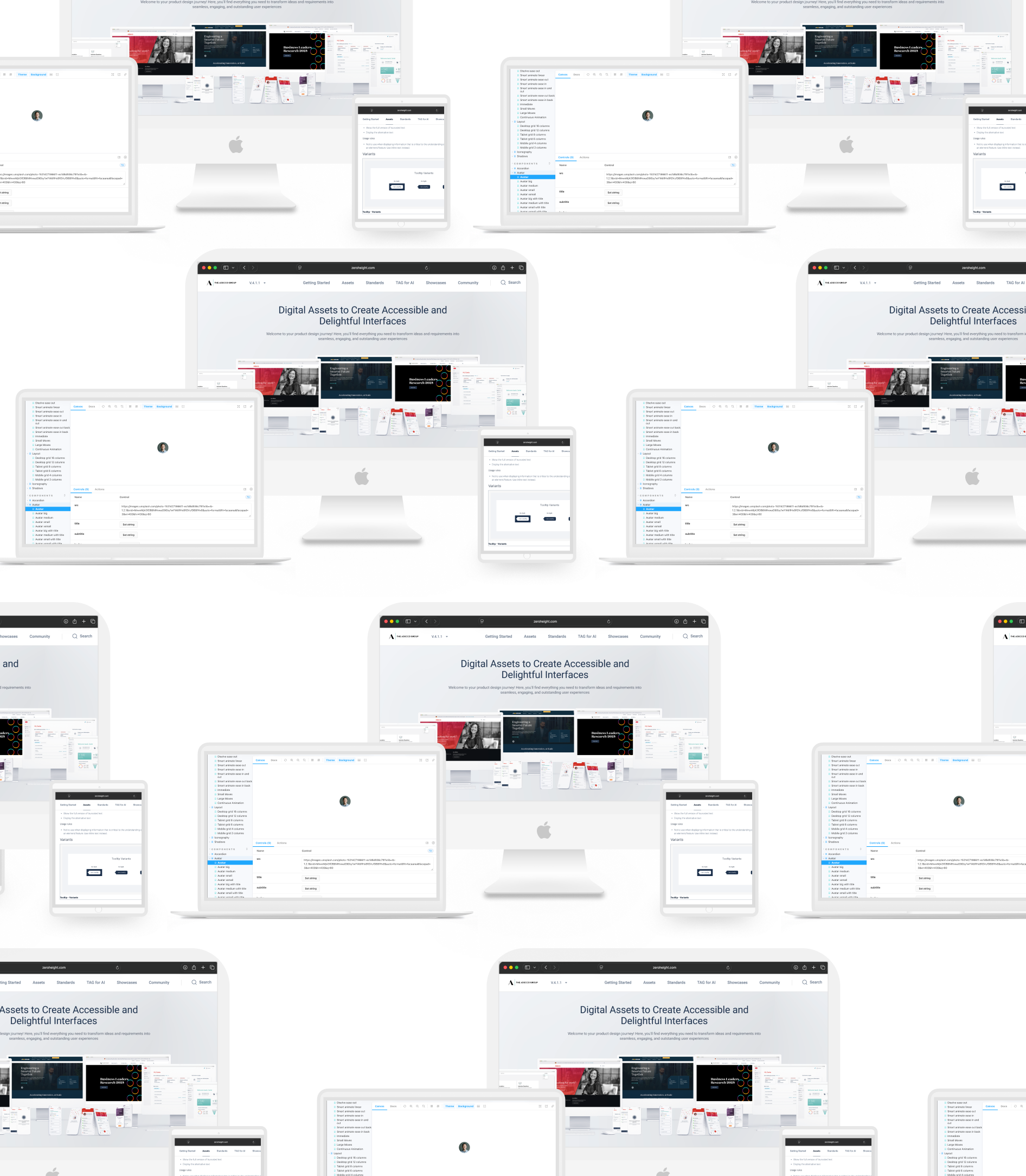
Company: The Adecco Group
TL;DR
I was the primary driver of a 4-week accessibility audit for Adecco Group’s React/Storybook design system. By aligning Figma libraries, documentation, and 110+ React components, I closed version drift, resolved accessibility gaps, and re-established trust between design and engineering. The result: a near 100% drop in accessibility bugs during QA, and onboarding cut from 5 days to 3 hours.
Context
The design system was widely adopted by designers, but engineering teams had lost confidence in it. Components in React, Storybook, and Figma no longer matched; accessibility issues were slipping into production; and documentation was outdated. My mandate was to lead a rapid but sustainable fix: audit, remediate, and establish governance so the system could scale.
Responsibilities
As the primary driver, I:
Led audit and remediation across 110 React components
Coordinated with frontend developers, product owners, and designers
Ran accessibility tests (BrowserStack, axe-core, manual WCAG checks)
Aligned Figma, Storybook, and documentation for consistency
Established governance workflows to prevent future drift
Technical Contribution
Audited and improved 110+ React components, aligning implementation with accessibility standards (WCAG)
Worked directly in the React component library and Storybook, ensuring design and code consistency
Identified gaps between Figma and production, and resolved version drift and implementation inconsistencies
Collaborated with engineers to fix accessibility issues using tools like axe-core and BrowserStack
Defined governance patterns (documentation, versioning, release notes) to prevent regression
Contributed to scalable design system practices across design and engineering teams
Outcome
Accessibility: 100% drop in accessibility bugs reported by QA
Efficiency: Onboarding ramp-up cut from 5 days to 3 hours
Trust: Improved adoption and confidence from distributed teams
Sustainability: Release notes, versioning, and demos established for long-term health
OVERVIEW
Accessibility Bugs and Version Drift Undermined Adoption
Through my audit, I uncovered that the design system’s core issue wasn’t just broken components, it was broken trust.
Version drift: Figma, Storybook, and React components were frequently out of sync. A button in Figma could look different or behave differently in code, forcing engineers to hack their own fixes.
Accessibility bugs: Missing ARIA roles, inconsistent keyboard focus, and color-contrast issues slipped into production. QA flagged them repeatedly, but fixes weren’t making it back into the library.
Documentation gaps: Many components lacked clear usage guidance, leaving developers to guess how to implement them.

The result was predictable: engineers stopped using the system. Instead of speeding up delivery, it slowed them down. In interviews, developers told me they’d rather rebuild a component from scratch than risk the inconsistencies.
By documenting these issues in a clear audit table, I created visibility into how version drift and accessibility gaps were eroding adoption. This gave me the leverage to drive remediation work that would restore confidence.
SUMMARY
With the issues surfaced, my focus shifted to making fixes that would not only close today’s gaps but also prevent them from coming back. I prioritized quick wins to rebuild developer trust, while laying down governance to make the system sustainable.
Turning Audit Findings into Lasting Wins
Quick Wins

Accessibility fixes first
ARIA roles, focus states, and contrast issues were remediated across 110 React components.
Structural Fixes
Aligned sources of truth
Figma libraries, Storybook, and React components were synchronized, eliminating version drift.

UI polish
Inconsistent padding, typography, and spacing were corrected to make design and code visually consistent.

Documentation overhaul
Usage guidelines and code examples were rewritten, supported with tailored onboarding guides and video walkthroughs.

Developer demos
I ran weekly walkthroughs showing updated components in Storybook, giving engineers confidence that fixes were landing.

Governance workflows
Introduced release notes, versioning, and a transparent update process so teams always knew what had changed and why.
By combining short-term fixes with long-term guardrails, the design system shifted from a liability to a trusted asset. QA reported a near 100% drop in accessibility bugs, onboarding was cut from 5 days to 3 hours, and adoption across distributed teams increased significantly.
PROCESS
After uncovering recurring bugs and version drift, I stepped forward as the primary driver of the audit. I created the audit framework, led a team of frontend developers, and positioned myself as the bridge between design and engineering to embed accessibility, alignment, and governance into the system.
Stepping Up to Drive Alignment and Governance
Audit & Discovery: Mapping the Gaps
I reviewed 110 React components across Figma, TAG docs, and Storybook. Using BrowserStack and manual checks, I documented accessibility issues and versioning mismatches in a detailed OneNote audit table.

Research & Insights: Understanding Developer Pain Points
While attending sprint demos, I noticed product teams under deadline pressure were challenging the design system, fragmenting the component library just to ship on time.
To understand the root causes, I interviewed developers and my own team.
Developers struggled with how components worked, how to set up pages, and the connection between code and designs.
My team was spending excessive time hand-holding new developers during onboarding.
Many developers were unaware of release updates or how those changes impacted their work.
From these insights, I identified two opportunities to win trust:
Improve onboarding with clearer guidance and tailored video documentation.
Improve the way release notes were written and shared, ensuring developers could act on them quickly.
““I don’t fully understand how these components are meant to work together. I end up guessing or re-creating them.””
“It takes me days just to get the components running — I spend more time setting up than actually building features. I usually need someone from your team to explain it to me.”
““I never know when a new release goes out or what’s changed, it’s hard to trust the system when I might break something without realising.””
Prioritisation & Collaboration: Building Trust with Teams
Product teams, under pressure to meet deadlines, initially wanted to create their own components. To redirect this, I asked them to identify their priority components. They returned with a list — and also asked for help with creating modules. We agreed that I would first focus on auditing and fixing the components, then move on to the modules.
To instil trust and transparency, I did the following:

Shared the audit table so everyone could track progress.

Opened up our sprint planning, demos, and reviews for visibility.

Improved release notes for our two-week continuous releases, highlighting design and development changes and signalling their level of impact (minor, medium, major).
Remediation: Closing the Gaps
Working with a team of frontend developers that I led, I divided tasks to address the fixes in the React component library and performed final consistency checks myself. Where there were gaps in the Figma libraries, I updated those directly, ensuring accessibility fixes and versioning alignment across both design and development.
Beyond compliance, I also focused on UI polish, tightening typography, color contrast, and spacing across components to raise the overall visual quality. These refinements ensured consistency, met accessibility standards, and gave product teams a reliable foundation for user-facing features.
Governance & Documentation: Embedding Long-Term Trust
To improve onboarding, I analysed the most common questions gathered through interviews and identified key gaps. I then updated documentation and created tutorials to address these needs. This freed up my team’s time and reduced developer onboarding from 5 days to just 3 hours.
To instill transparency, I shared audit tables, opened up sprint demos and reviews, and overhauled release notes. Each release clearly highlighted design and development changes while signalling their level of impact (minor, medium, or major). This open, transparent approach mirrored open-source contribution models, where clarity and visibility are key to adoption across distributed teams.
A System Teams Could Finally Trust
By closing the gaps and improving governance, the audit quickly changed how product teams worked with the design system.

Adoption Strengthened
Product teams began relying on the React component library instead of fragmenting or building their own solutions.

Trust Restored
Transparency through shared audit tables, release notes, and sprint rituals improved collaboration between design and development.

Delivery Risk Reduced
With accessibility issues resolved and clearer component guidance, product teams faced fewer blockers and less pressure on meeting deadlines.
TAG Design system - promo video
OUTCOMES & LESSONS
The audit transformed a fragmented, inconsistent design system into a trusted foundation.
Accessibility bugs dropped to near zero, onboarding accelerated, and adoption grew across teams, directly improving how quickly and confidently features reached users.
78 %
Near 100% drop in accessibility bugs across product teams.
94 %
Faster design sign-off during development cycles.
3hrs
Onboarding reduced from 5 days to 3 hours, improving developer efficiency and reducing dependency on my team.
Increased trust in the React component library, reducing fragmentation across products.
Beyond the measurable results, the work proved governance is as critical as components.
By building transparency and trust, I shifted the culture toward lasting adoption and collaboration.
Accessibility: QA reported a near 100% drop in accessibility bugs after remediation.
Efficiency: Onboarding ramp-up time for new developers fell from 5 days to 3 hours.
Adoption: Distributed teams began using the system again with confidence, cutting down on duplicate component builds.
Trust: Engineers, designers, and product owners now saw the design system as a reliable source of truth.
Key Outcomes & Results
Governance is as critical as components. Fixing the library solved today’s problems, but the governance workflows ensured future consistency.
Quick wins rebuild trust fastest. Addressing accessibility issues first gave developers confidence that changes mattered.
Transparency pays off. Sharing audit tables, sprint demos, and release notes kept teams aligned and prevented version drift.
Bridging design and code is leadership. Acting as the connector between design, engineering, and product meant I wasn’t just fixing components — I was fixing collaboration.
What I learnt